Understanding the Tecton Dataflow diagram
The Tecton Dataflow diagram renders an end-to-end visualization of feature lineage, from data sources through serving features in production. The Dataflow visualization helps you better understand the content of your workspace and feature pipeline dependencies.
This guide shows how to understand the Dataflow diagram in your Tecton account. For more information about the value of feature lineage in production AI, see this blog post.
Dataflow nodes
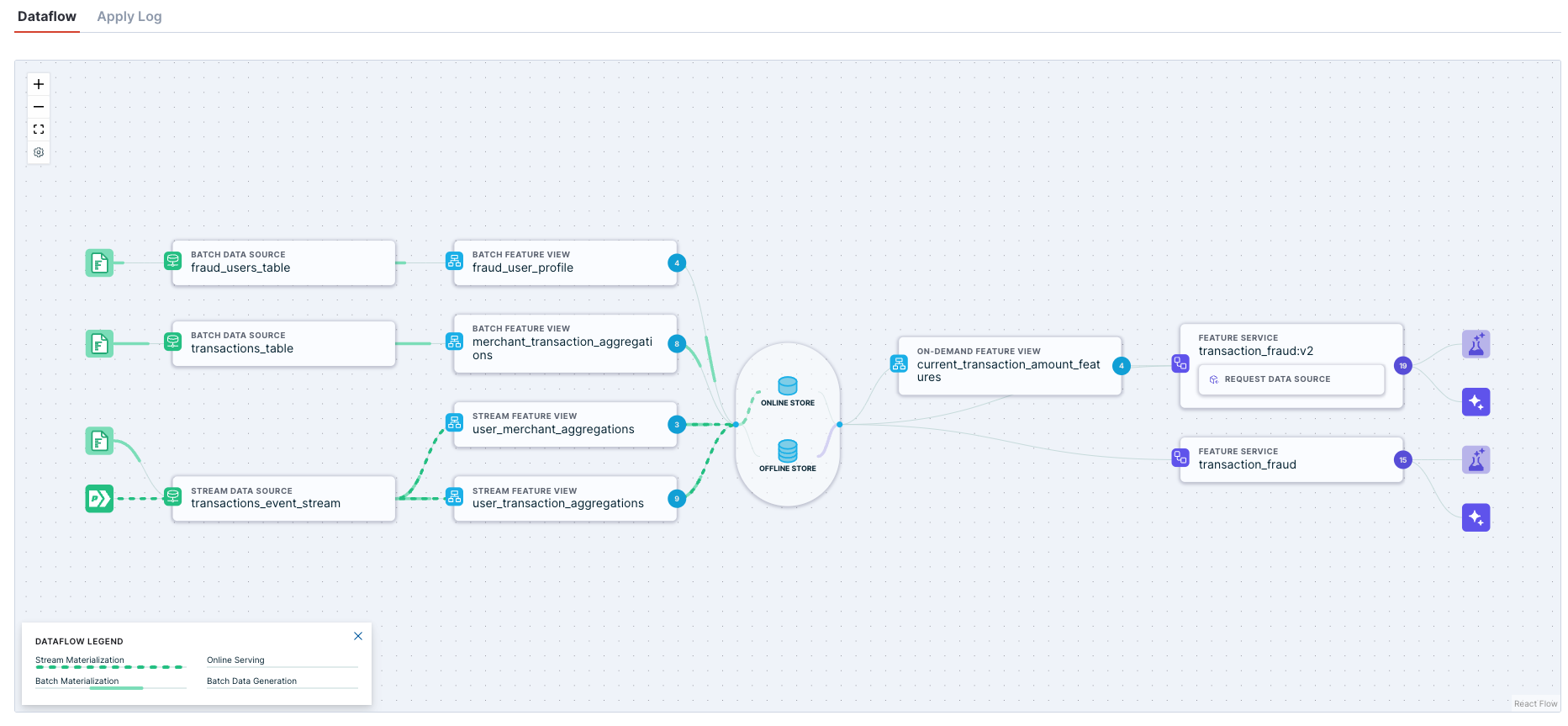
The Dataflow diagram lays out a feature pipeline from data sources on the left, to feature consumers on the right.
Last reviewed: Jan 2025
In the standard view, each node on the diagram represents a step in the feature pipeline. From left to right:
- Data inputs are actual data stores that connect to Tecton, such as Hive or Kafka.
- Batch or Stream Data Sources connect to Data inputs upstream, and expose a standardized interface for Feature Views downstream.
- Batch or Stream Feature Views connect to Data Sources upstream, and output feature values. If materialization is enabled for the Feature View, then the diagram illustrate those features writing to the Feature Store.
- Online & Offline Feature Stores persist feature values for fast retrieval.
- Realtime Feature Views calculate features at request time. Upstream inputs may include Request Data Sources included in the feature request, or the outputs of Batch or Stream Feature Views. If connected to a Batch or Stream Feature View, the Realtime Feature View may illustrate reading those features from the Feature Store if the values are materialized, or reading directly from the Feature View for offline retrieval if materialization is not enabled.
- Feature Services define how features are accessed. The diagram will show the Feature Service accessing features from the Feature Store if they are materialized, or reading directly from the Feature View for offline retrieval if materialization is not enabled.
- Feature consumers represent your services that access data from Tecton. The Model Trainer node represents offline data access. The Model Inference node may represent online or offline data access, depending on how the Feature Service configuration.
Dataflow summary view
Some workspaces may have hundreds of Data Sources, Feature Views, and Feature Services. If this sounds like your organization -- nice work!
To improve browser performance in these cases, the Dataflow diagram will default to a summary view that shows the count of each object type, rather than every individual object.
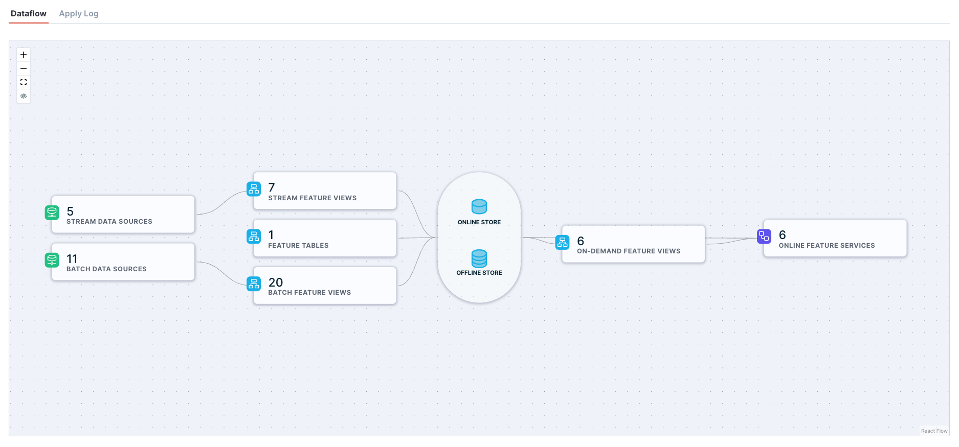
Click on the "eye" icon in the control panel to switch to the full diagram view. Note that you may experience degraded browser performance and load times for large workspaces.
Lineage tracing
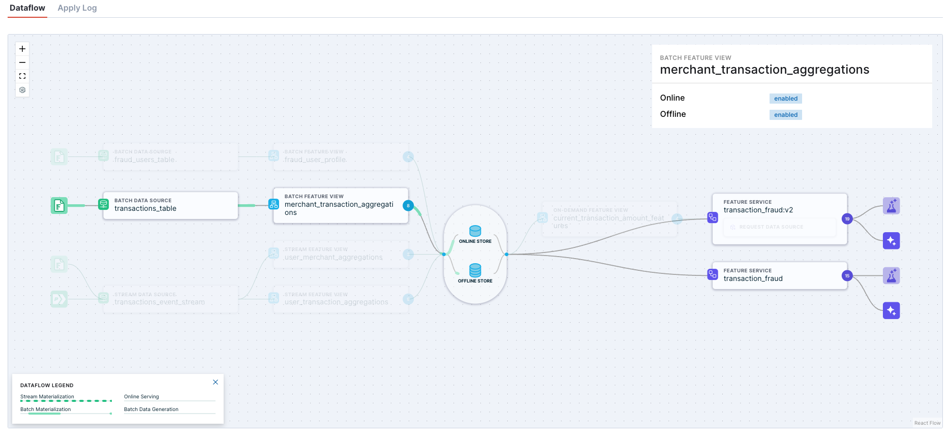
The Dataflow diagram excels at helping you understand lineage for every part of your feature pipelines.
Hover over a node in the diagram to see all the upstream dependencies and downstream in the pipeline.
Dataflow animations
The Dataflow uses different animations to illustrate how the data, well, flows.
- When a Feature View has materialization enabled, green animations will show where data is processed in batch or streams and written to the Online or Offline store.
- When a Feature Service has been configured, purple animations will show online and offline retrieval flows.
For large workspaces, animations may be disabled by default to improve browser performance. To enable animations, click on the settings icon in the control panel.